Comparing Data Visualizations: Bar vs. Stacked, Icons vs. Shapes, and Line vs. Area

Great data visualizations have the power to persuade decision makers to take immediate, appropriate action. When done well, data visualizations help users intuitively grasp data at a glance and provide more meaningful views of information in context. Good data visuals give busy workers a high-level summary of important data. They also offer a big-picture perspective and highlight trends, anomalies, and outliers while giving users the option to drill down into details and ask new questions when needed.
Related: 16 Data Visualizations to Improve Your Application
But not all data visualizations are right for every dataset. Choosing the wrong visualization could turn your dashboards and reports into a confusing experience for the end user. Modern data visualization platforms offer countless options. However, When application teams are faced with a choice between countless charts and graphs—from 2D visualizations like pie charts, line graphs, and stacked charts to more advanced 3D charts like heat maps, text clouds, GIS maps, and more—it can be difficult to know which visualization to use for which type of data.
What data visualizations are right for different datasets? We’ll look at three common debates and offer tips on choosing the right visualizations.
Bar vs. Stacked Chart
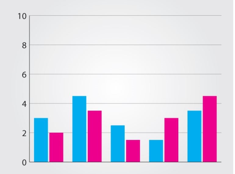
Bar charts are best used when showing comparisons between categories. Typically, the bars are proportional to the values they represent and can be plotted either horizontally or vertically. One axis of the chart shows the specific categories being compared, and the other axis represents discrete values.
Stacked bar charts can be visually appealing, and you may be tempted to use one to represent the same data as shown above. However, when a bar chart becomes a stacked bar chart, not everyone reads them correctly—which can lead to incorrect data analysis. The stacked bar chart below can be misleading: Users may not know whether the pink area starts from the same baseline as the blue (at 0) or if it starts at the top of the blue area—both of which can be difficult to interpret.
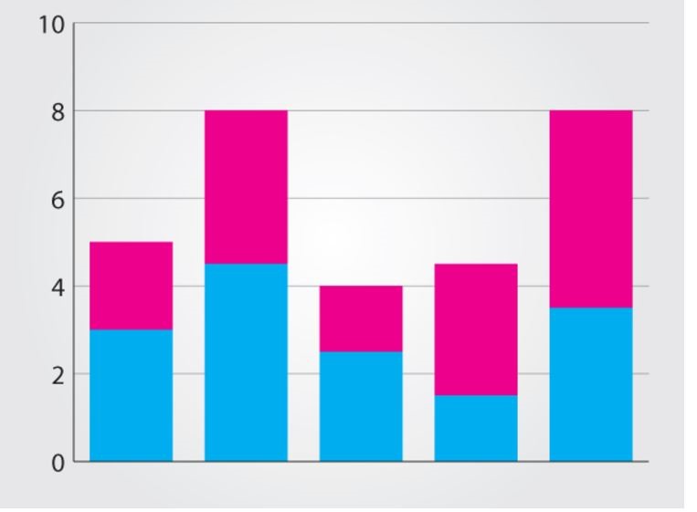
When to Use Stacked Bar Charts vs. Bar Charts: Stacked bar charts are a good way to represent totals. Otherwise, stick to the bar chart.
Icons vs. Shapes
With the amount of visualization tools available, it can be tempting to become too creative in your choice of visualization. Many application teams try to show parts-to-whole relationships with an icon, as shown here.
![]()
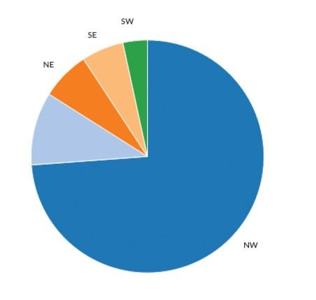
But sometimes the old tried-and-true pie chart or circle chart is best when representing standard relationships. As long as all the parts add up to one whole, then a pie chart is a god choice. These charts are much clearer than an icon.
When to Use Icons: If you’re displaying data in another format—such as in a brochure or a blog post—you may choose to show an icon with a clear percentage number next to it. But within a dashboard or a report, icons should generally be avoided.
![]()
Line Chart vs. Area Chart
Both line and area charts are great for showing trends over time. So when is it best to choose one over the other?
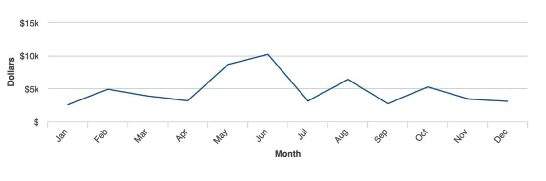
Line charts are the best choice to visualize continuous data over time:
You could also add a trendline or a goal line to this chart to illustrate performance in a certain period against a set benchmark.
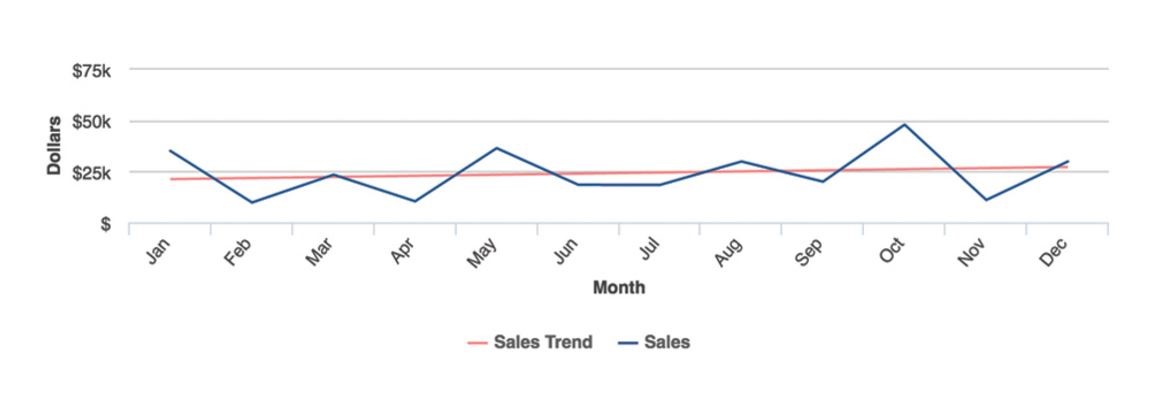
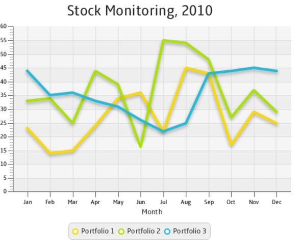
Line charts are also useful to compare two or more trends over time:
On the other hand, area charts are best used to show cumulated totals over time via numbers or percentages. These are basically line charts that are filled in to provide a deeper view of multiple series of data within the chart.
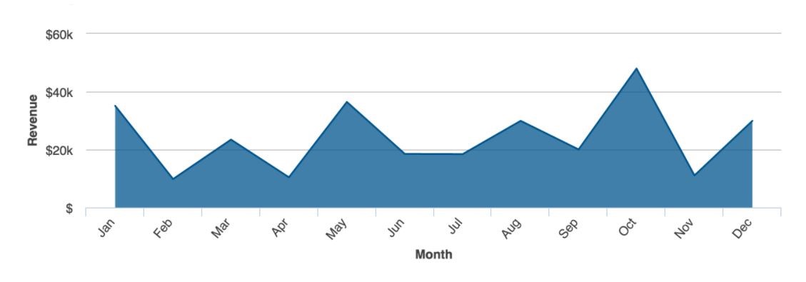
Do not use area charts when you do not want to show totals. Filling in the area under the line may confuse the reader.
Best Practices for Choosing the Right Visualization
We rounded up some best practice tips to help you choose the right visualization:
- Do Your Homework: Start with the end user in mind. Create user stories, gather requirements, make wireframes and ask your users what they’re trying to accomplish as they analyze a particular dataset.
- Be Selective: What type of data needs to be visualized? Stick with critical items. Too many data visualizations on one dashboard may just add clutter and lose their impact and usefulness. Don’t forget, data visualizations are a visual form of analysis illustrating critical items to the user.
- Choose the Right DataViz Type: Each type of information has an appropriate visualization. As stated above, a pie chart is best used to show relative proportions between pieces of data; a line chart is best used to track an item overtime; a bar chart is great to show comparisons between categories. There are others we didn’t cover in this post, like GIS maps which are essential for spatially relevant data, and heat maps which are ideal to show two column values of multiple rows. But the six types of visualizations here are some of the most commonly used—and misused—charts out there.

Level-Up Your Data Visualizations to Enhance Financial IQ
Watch Now